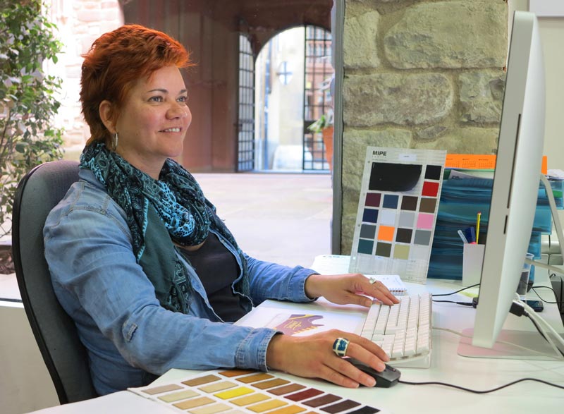
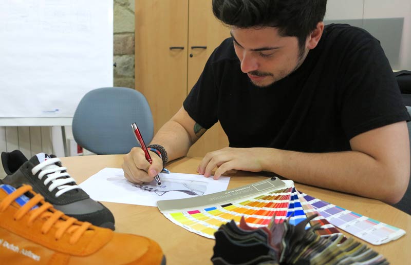
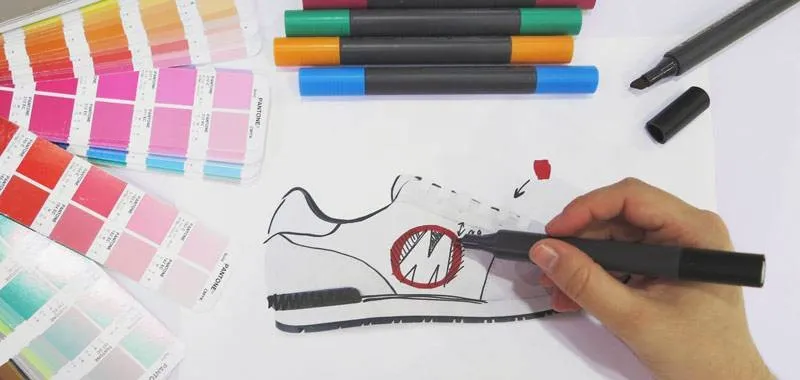
In each group there’s a diamond tip, the secret weapon, a beating heart.
Here they are, in a short interview our designers shared with us some pearls of wisdom to illuminate us about the art of creating sneakers!
How do you create a modern and original sneaker? What is the source of your creativity and inspiration? Do you compare with other brands?
Eva: No comparison, I rely heavily on the company’s style, I look at the website, if they have some uniforms and I create a shoe that can be matched.
Pau: I get my inspiration informing me on how the market is running, how the competitors work (eg. Nike, Adidas) and what trends are most followed. In that way I create my base from which I get inspiration to draw new sketches.

Tips: What are the best colour combinations? What logos do you value most?
Eva: I like colours of the same range that don’t bother the eye, or small contrasts in details with a dark base and clear finishes. I don’t have a favourite combination, I like to use warm colours more than others, such as red or orange. In logos I prefer symbols than names or letters, simplicity is the best feature.
Pau: The combinations are fine when colours contrast, I particularly appreciate the strong contrasts with very dark and some clear hint. It gives a feeling of vitality and depth at the same time. Yellow and black is my favourite combination for excellence. An easy logo is easier to work and match it to colours, complex and articulated logos are the biggest challenge. In that case I follow the corporate or dominant colour, or I look for some alternatives that can fit well.
What are the pros and cons of each BYS model?
Eva: I think about the processing techniques, embroidery fits perfectly to the Retro as well as the Classic. Vintage, instead, has free space for prints of any kind. Urban is weaker because of the little space where you can play with the logo.
Pau: To make a ranking, Retro is the most spacious and gives you the ability to play more with both colours and materials. The Classic has an elongated, clean shape that gives the opportunity to position the logo well on the side. Third place for Vintage that has a spacious side for logo positioning but is more limited to material variation. Ultimately the Urban, very beautiful but with a smaller side to give a perfect logo view.

What do you like the most and what less of your job?
Eva: The biggest satisfaction is to make a design proposal, first approved, then see it made and say “I created it myself!”. Less pleasant is when the customer definitely wants to use his logo without compromise, the best challenge is to be able to satisfy it by making the most of our range of colors and materials.
Pau: The beauty of design is that it allows you to access every time in different realities, every shoe is a world of its own and it’s fascinating to be able to reinvent each model. The toughest part comes when dealing with “bad” logos, which close the chances and make it difficult to match.
What advice do you give to new designers?
Eva: Simple is beautiful, essential colours and a few letters have been the key to our best productions
Pau: Experiment, don’t just putting the logo at the centre of the shoe but turn it around, move it, attempt different combinations and try them all. So you get an excellent result at the end.

