Image and corporate identity are a key part of the branding strategy, communication, and marketing of a company. Many companies decide to showcase their best in big events, fairs, or congresses.
Others use our products as gifts for both marketing projects and for their work teams. In this article, we would like to challenge the idea that branded sneakers only fit certain brands because of style. We’ll provide a few great examples of the design genius that allows us to appeal to a wide variety of brand images.

KEEPING IT SLEEK
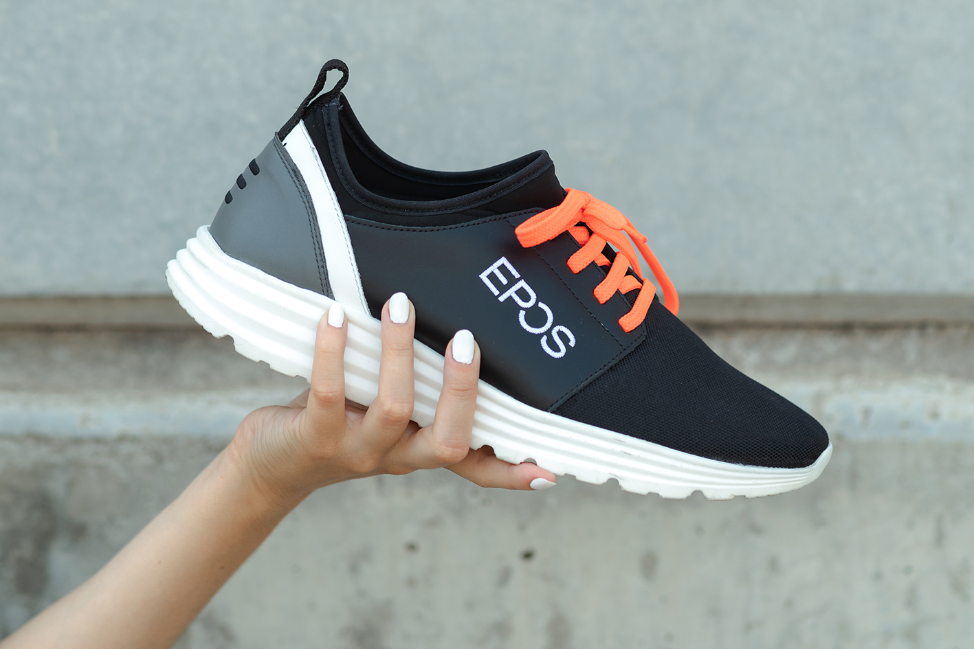
The technology sector has been a staple in our arsenal of sleek designs. Even with our least formal shoe models, it is imperative to respect the image of companies who are dedicated to a sector that is notoriously minimalist in their branding design. In this example created for EPOS, we wanted to ensure that comfort was not sacrificed in the model selection process because of the end-use of the product. For each project, we consider the most fitting option. In some cases, optimal comfort comes as 2nd priority, such as this next design created for an iconic snacking brand from Spain, Donettes:

PROMOTIONAL CREATIVITY
When a company works with us for a marketing campaign, understanding their overall concept and objective is the key. Aside from the bold and apparent use of logos in these projects, we also get to have a lot of fun with the creativity involved. The best part of seeing our work finished is watching these campaigns launch and seeing the responses from the intended audience as they win a unique promotional product. What’s clear about this style of design, is that it won’t be forgotten.

THE PERFECT COMBINATION
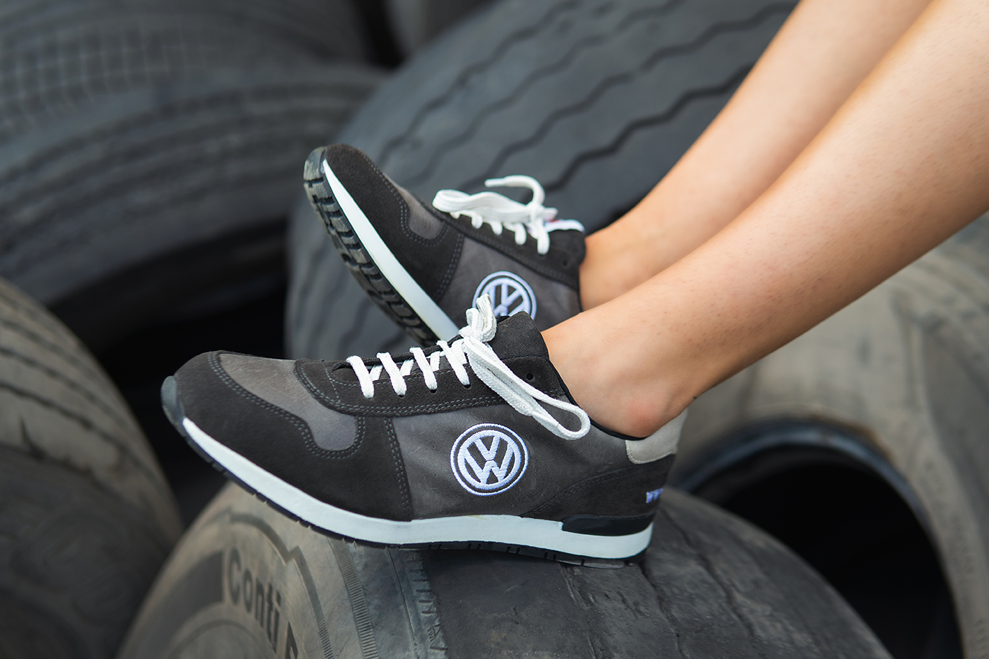
In the case of these Volkswagen Sneakers, all of the requisites for an on-point brand representation are checked. Starting with the model of sneaker that they chose, and the MVP of our selection, the Retro model. There’s something about this classic sneaker shape that pairs so nicely with this timeless brand. Their logo was chosen in contrast in this design to sit on top of the perfect shade of Nappa leather and the finishing touches are added with the suede detailing in a complementary shade of grey. When we bring all these elements to light and finally combine them, we achieve the perfect pair of sneakers to tell a visual story of microbuses and beetles.
Thank you, BrandYourShoes design team!
Want to receive proposals with your company’s branding? Let us know HERE and we will accompany you in the process of making it happen.


